There was a lot of discussion when we did a netbook interface with the application menus in the top panel. Now that we're talking about taking the same interface to the desktop, there is new concern. Personally, I have always put myself in the camp of people who prefer their menus inside the application window. But why? Is it just something that I'm used to?
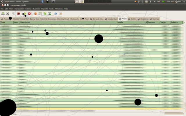
So in an attempt to figure out how I really use menus I wanted to watch myself using a program as a user, and using a program that was a "typical GUI" type program (not a development tool). The one that I settled on is GnuCash. I've used GnuCash for years, but not done any development or other work on it, so I figured that even though it was somewhat specialized software I could consider myself a user of it. I then used IOGraph (sadly not open source, and Java) to record my mouse for an hour of doing my finances in GnuCash. Here's what it created:
What seems the most interesting to me is that I hardly use the menus at all. I do use the toolbar a bunch, and I interact with the register. So it makes me wonder, in a well designed application, it would seem that all the functionality I need quickly would be a toolbar; and the menus only exist to expose the full breadth of functionality that the application provides. If it's the case that I only use the menus when exploring, it seems to matter very little how far they are away from the canvas I'm working on.
Obviously this is not scientific in any way, shape or form but in the end; I wonder if we spend more time debating where the menus should go than we do actually using them.
posted Nov 1, 2010 | permanent link
