It's said that in real estate the most important thing is the location, and that's also true when thinking of screen real estate. How big something is and where it's located is tied closely to how useful it is.

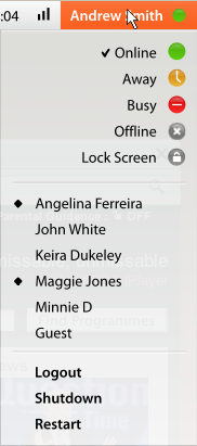
The point is accentuated when it comes to the corners of the screen. These four precious areas are very easy to mouse to, making them very quick for oft used items. In the current Ubuntu default desktop we've chosen to give the upper right hand corner to bringing up the logout/power dialog. While this is a good use, I think we can do better.

One of the problems with that solution is that we're using a whole corner for basically only one function. While it's an important function (turns out the center of the Earth isn't oil) it would be nice if we could put more functionality into that location.
The functionality that we're looking at putting into that corner is managing your IM status. Almost every user I see today is using some form of messaging client. If we look to optimize the interactions with instant messaging we're likely to see productivity gains for large numbers of users.
The other piece of functionality that we'd like to put on the same menu is fast user switching. This is a very handy function, but it is directly related to logging in and logging out. In many ways it is similar to "Pause session."
All in all, the better use we can make of our corners, the more efficient we make our users. If we have users that are 100 times more productive, even if we only have 5% of users, we can rule the world!
This update may or may not make users 100 times more productive, it hasn't been tested so it might, we just don't know. Remember, numbers never lie.
posted Jul 30, 2008 | permanent link