I've been toying around with this idea in my head for a while, and I think it is mature enough to post on my blog (basically, not very mature).
The situation: every graphics application has some way to enable grid lines on the drawing area. This is more popular in more technical drawing programs, and many artists don't use it. What this does is put regular lines on the image so that the user can space the objects at very known, and by default, regular distances on the image. This is contraining, but you know where the things are on the image. (for more info. here is a nice history of the grid)
While this is important for creating images that are spaced nicely and regular, it really isn't the goal of the designer. The designer's goal is to create an image that is balanced, not have objects that are 16 boxes apart. So, infact, the grid becomes limiting as many times images have to be reworked as more grid lines are needed. What a designer needs is subtle hints at these relationships in the design, so that she can exploit them.
The solution: aesthetic grid. Basically this would be a grid that is generated based on the elements in the picture, not boxes. So there would be lines that come out of the center of the object (probably should be center of mass, but that is a different story) at various angles. Also, the shape of the objects should replicate so that other objects can be aligned to their outline. Finally, the spacing between the objects should also have hints allowing more objects placed at the same, regular interval.
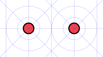
Now, if we look at the image above there are two circles, and lots of aesthetic grid lines. There are lines coming out of each of the circles at the 90 degree lines and the 45 degree lines. Also, the shape of the two circles is replicated at the radius, and then at the full diameter. Lastly, on the edges, you see that the half spacing that is identified in the center of the two circles is replicated on the outsides. If the image is continued there would be a guide at the distance of the two circles.
Issues: Well, you knew that there had to be a section like this didn't you? I think one of the issues is how to keep the display clean on complex designs. Obviously various objects will loose their influence on the design relative to their size with the rest of the objects in the scene. So a large square with a little circle, the circle is likely to have less meaning at a distance greater than the width of the square away. But, in that distance, the circle could have huge meaning. So aesthetic grid lines need to decay. Not entirely sure how that should work though.
Also, there are going to be artist who prefer slightly different grids for working. Is it better to have guidelines every 15 degrees or every 5? What options need to be given to create and adequate work environment?
posted Aug 3, 2004 | permanent link